


All Souls Langham Place
Branding & Strategy
Vision & Values
, Branding & Visual Identity
, Guidance & Training
Designed by John Nash in 1810 and consecrated in 1824, All Souls Church is one of the most iconic, historical Anglican churches in London today. Situated opposite BBC’s Broadcasting House in Langham Place at the north end of Regent Street, All Souls is at the very heart of London.
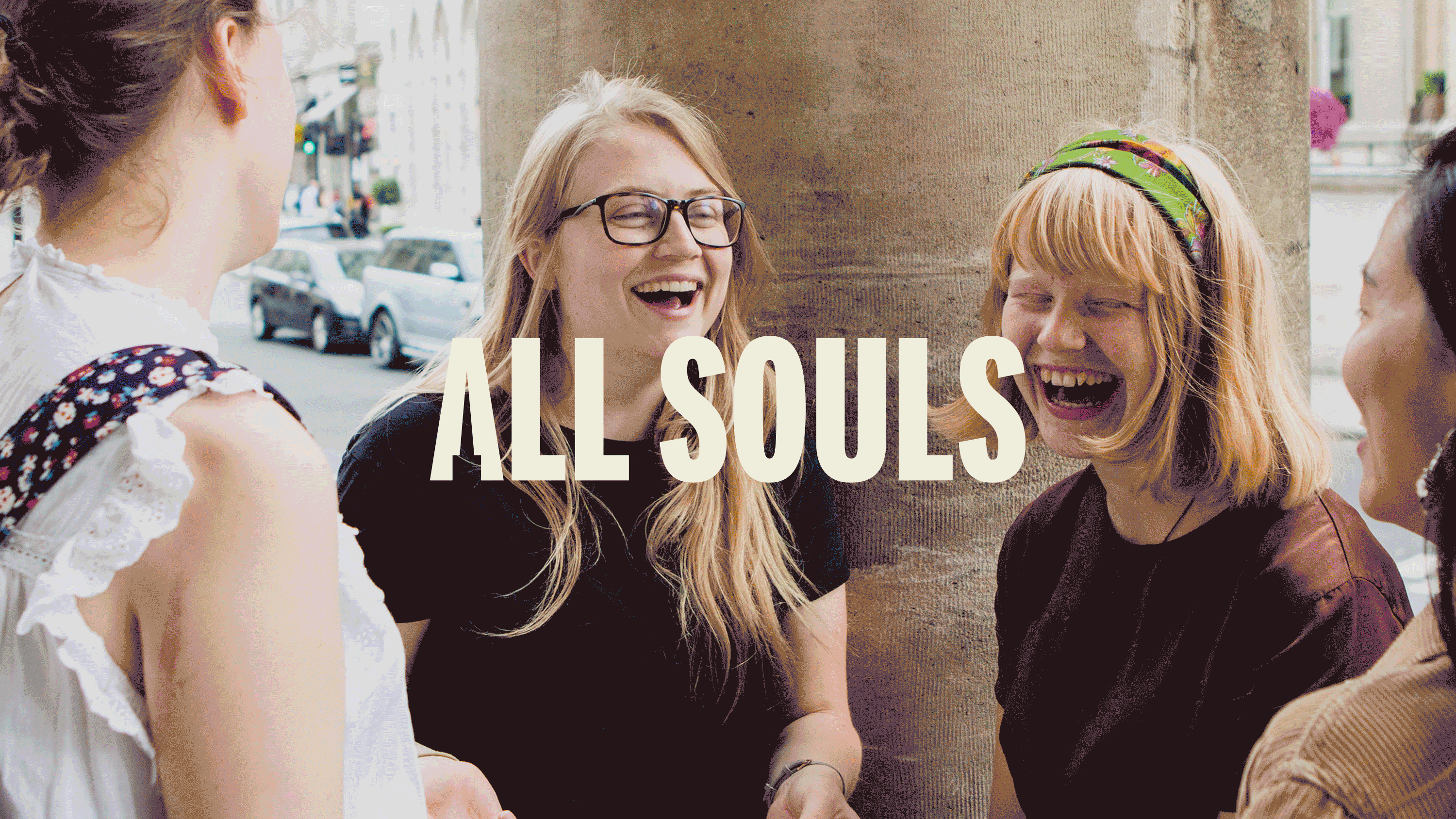
Although well known for the venue’s historical importance, the church body itself is a lively, growing and active community, with ministries operating throughout the capital and beyond. From an internationally recognised Orchestra, to local community outreach programmes, All Souls is a busy, passionate and vibrant church seeking to connect with the people of London.
Vision & Values Workshops
Our initial involvement with All Souls was to help rediscover and realign some of their core vision and values. We began a group workshop, calling in leaders from every area to unearth the broad spectrum of church life, from culture to calendars, volunteers to operations. We needed to fully ‘know’ All Souls from the basement up so that we could collectively understand and explain with clarity who we are and why we are here.

We researched and reviewed the church calendars with the teams to see the week-in, week-out operations - better understanding the outworking of the vision of All Souls. We discussed what it means to be a part of All Souls, who it involves and engages, where it reaches and why. We reviewed the incredible heritage and scriptural foundations of All Souls, contrasting and comparing them to today’s culture and socio-economic environment. We effectively drew up a wealth of knowledge internally and externally about the makeup of All Souls Langham Place, so that we could stand on solid foundations and know how to help the core All Souls team underline the values that continue to run deep and highlight new values that speak truer to who they are today.

The result was so effective, the team decided to create a campaign ‘All for Jesus’ that ran throughout the latter part of 2019, showing London what’s at the core of All Souls and also inviting the congregation to come and take ownership of All Souls’ wider church mission.
A board was erected at the entrance and the congregation were invited to put their names to the statement ‘All for Jesus’ as a mark of their agreement and ownership.
We were then invited to help marry their branding with their new vision and values, as what they currently had was simply no longer reflective of the broad spectrum their church community encompasses. We needed to help build a brand that is able to grow with a hugely diverse and complicated organisation. A brand that equally recognises and respects youth alongside heritage, creativity alongside community and would help communicate their mission with clarity. They needed a ‘brand’ as iconic as the venue itself.

“It’s been a real honour to step into such an iconic place and meet the people behind the incredible work going on at All Souls. Helping guide them to a refreshed vision and values document came with a huge sense of achievement, bringing together leaders from every area of the church to find the real ‘why’ behind what they do and combine all those passions into one voice. It’s really exciting to see how All Souls will grow from here.”
David
Boxhead

Branding & Visual Identity
After a short review of the strengths and weaknesses of their previous visual identity, we began by using the newly revised mission statement as a guideline for the next, via three key words lifted directly from the document: Proclaim, Community and Creator.
Proclaim - Proclaiming was and is something All Souls has continually done since its inception - “Proclaim the Good News…”. A message to be shared far and wide has had almost one platform since the foundation of All Souls - the local newspaper. We sought to find a route that could carry the heritage of the message into today’s society, using typography and application to generate the sense of impact and an urgent, important message.
Community - London is vast and filled to the brim with a vibrant, complex patchwork of beautiful people from all walks of life. The challenge was to try and represent that community in a single visual identity, that would embody the values and vision of All Souls.
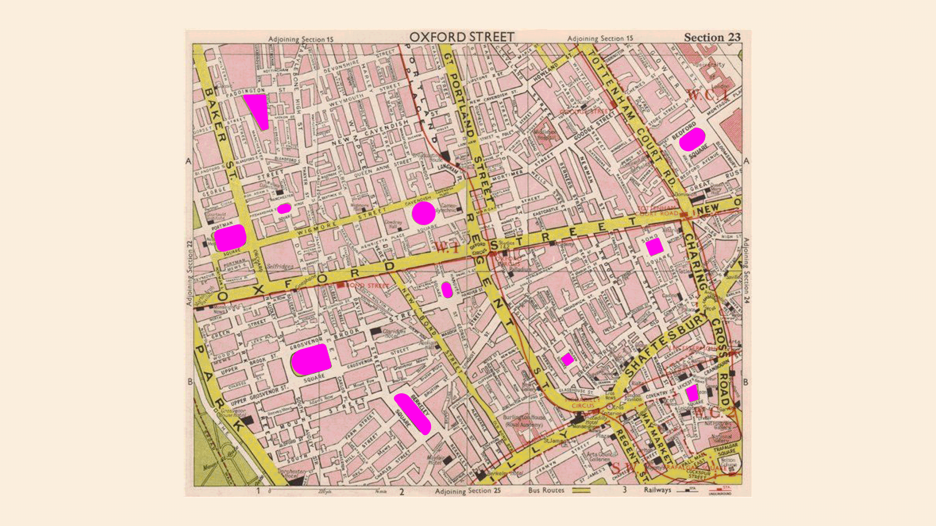
We pulled shapes from maps of the communal spaces in and around W1 in London (near Langham Place) and began working with colours and fonts from street signs and the London Underground. The idea was to create a brand from everything around Langham Place, inviting people to join us and to underline that as a church we are very much a part of this community.
Creator - From the beginning of time, God ‘was and is’ - this direction needed to be almost primitive in nature to reflect the simple yet magnificent complexity of God’s unwavering message to the people of London and beyond. Iconic, basic shapes and monotone colours were used to draw singular clear focus and lead to a much deeper symbolic meaning.


What resulted from this work, was - as often happens - an amalgamation of the three directions. The underlying message behind the icon is as simple and historic as the day the building was founded - using the spire in the ‘A’ of All Souls to highlight our reach to God and God’s reach to us. The various typefaces researched and finally used were all inspired by those found readily in the tabloids today, proclaiming news - our good news of Jesus. And what would the church be without the community that it is so a part of? We continued to use the shapes taken from public space around W1 and juxtapose them playfully, to give visual freshness and excitement, all the while underlining our promise to always be community focussed.


The new visual identity of All Souls has stepped away from heavily scripted typography - a constant issue for clarity - as well as dropping ‘Langham Place’ as the All Souls church stretches far beyond a location


Guidance & Training
Every step of the way, we involved the All Souls team, working with a core dedicated few and reviewing with a broader audience when needed. We completely understand that each brand must grow and flourish beyond our work, handing on the baton to the internal communications team. To help give them the best start and insight into how to grow the brand, we trained the All Souls communications team and built a comprehensive brand guide, covering everything from logo usage, to sub-brands and wayfinding tools.

The brand is now iconic, flexible and durable, representing the heartbeat of All Souls and it’s commitment to be All for Jesus.
Related Work
